Objects
Paramters and Components
Objects are the basic building blocks in the Grasshopper canvas. Each object performs a specific function, such as creating geometries, transforming shapes, performing mathematical operations, and so forth. Objects have inputs and outputs that you can connect using wires.
In Grasshopper, there are multiple types of objects, but we'll focus on two primary ones: parameters and components. Parameters are essentially data containers. They store various kinds of information, such as when we use them to reference geometries from Rhino. On the other hand, components are actions containers. They perform tasks, like analyzing and deforming geometries.

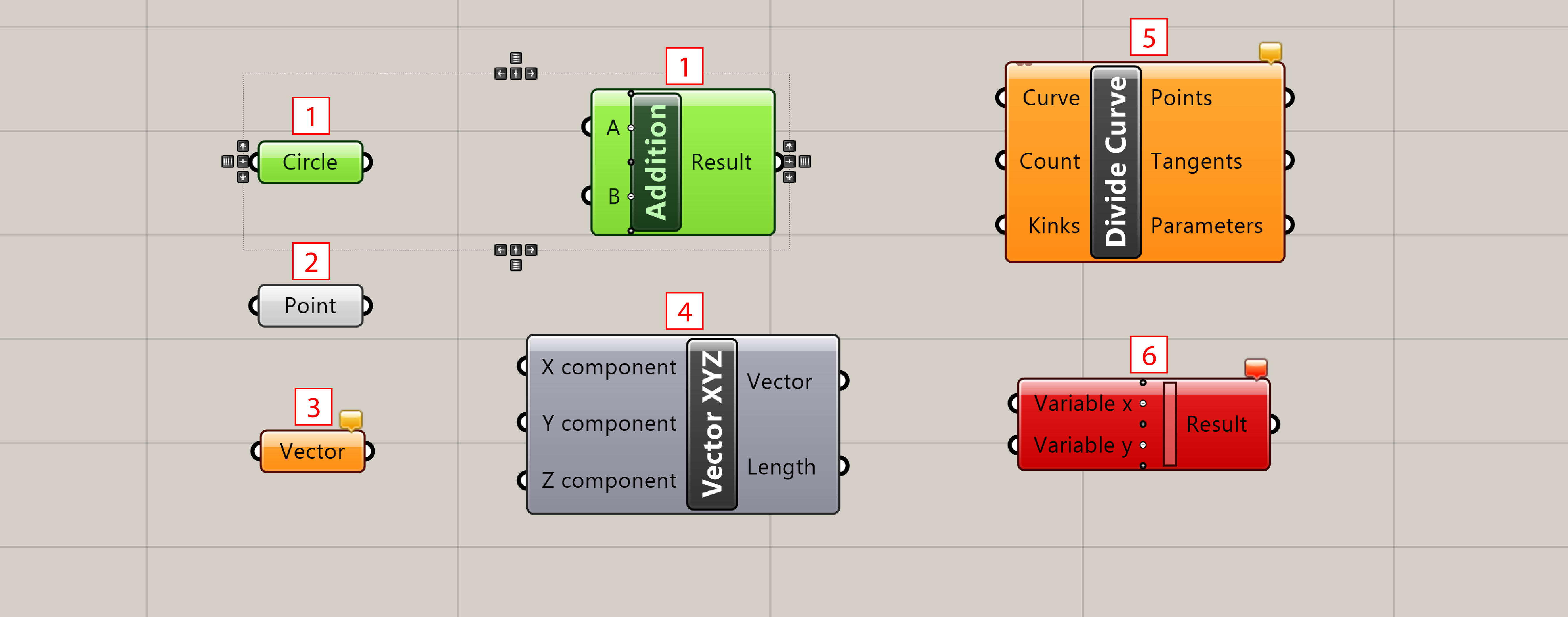
Paramters (left) and Components (right)
Add Objects
Each object can be added to the canvas by a "drag-n-drop" process.
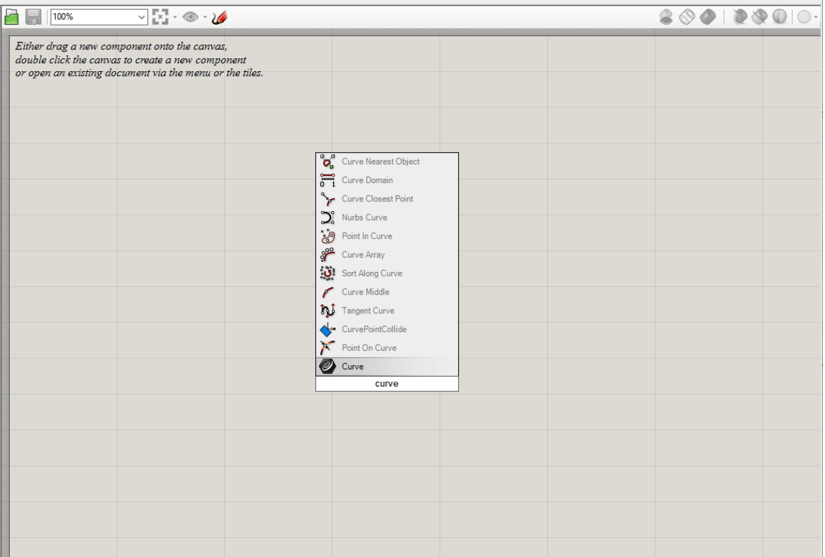
Alternatively, you can double-click the canvas or press the spacebar, and search by its name.
Many components' names are very similar to common commands and functions within Rhino.
If you have a certain action in mind and know its command for Rhino, try finding the
corresponding component in Grasshopper.

Command line in Grasshopper
Objects Status
Objects on the canvas are usually color-coded to provide feedback about their status: Grey indicates neither warnings nor error. Orange is indicative of a warning, meaning the component is functioning and there might be outputs, but there's something you should be aware of. Red means there's an error, meaning the component cannot complete its task due to some issue with the input data or other conditions.

- All objects selected within the Grasshopper canvas are drawn with a green overlay.
- Parameter which encountered neither warnings nor errors.
- Parameter which encountered a warning are displayed with an orange box. Note: A lot of parameters and components are orange when you drop them onto the canvas since the lack of input data is considered to be an error.
- Component which encountered neither warnings nor errors.
- Component which has at least a warning associated with it. You can find warning and errors through the context menu of objects.
- Component which encountered at least an error. The error can come either from the component itself or from one of its input/output parameters. We will learn more about component structures in the following chapters.
Component Composition
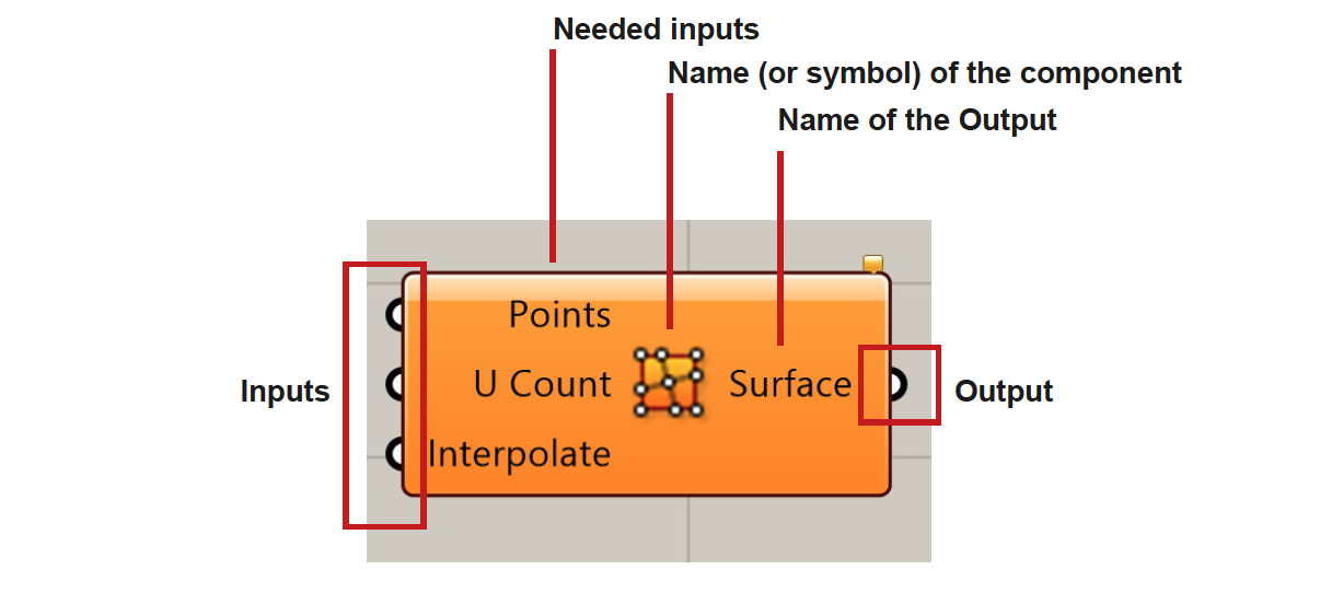
As a actions container, a component requires inputs to execute tasks and produce the desired output. Typically, a component is structured into three parts: input nodes on the left, the component's name or icon in the center, and output nodes on the right. By linking the output of a parameter or another component to its input, you can supply the necessary data to the component.

- Needed Inputs - If you hover over the input node of a component for a few moments a window will pop up, giving you more information about the type of input this component expects.
Note: To directly set the data source for a paramter without connecting output from a parameter or component, you canright clickon the input not and selectset one [data source]orset multiple inputs, see details.- Output - similarly, hovering over the output node, you could get more information about the output, like data type and structure.
Zoom-In Interface

Some components offer additional input nodes if you zoom in. With the plus (+) and minus (-) you can add or remove input nodes from the component if needed.

